A public dumping ground for words and pictures. Contact me at ThomasTamblyn@Gmail.com

Sunday 15 December 2013

Pagemages and Boozehorns


These were me getting back in the saddle after a while away. They started with the pose, pulling something out of a book. The scarf was to add a little character beyond generic wizardliness. The robes are lazy I confess. I too often go with shapeless full-length robes, but I think the shading here gives them a bit more definition. I feel good about those creases. They're not great, but my first effort was so much worse. And I feel I've imrpvoed from recognising the problems and fixing them.

I'm sticking with doing vector colouring/shading, and I made the linework for these with that in mind. So I knew I'd be putting a coloured pattern on the scarves, and that I could demarcate #1 and #2's hair without needing to blackline it. Which is new. I used the "spare" lines left in the budget to put a little more expression on their faces. Not sure about that. I wonder if it would be better to do it on the shading layer. I think it's only a matter of time before I give up on the no-mouth line-eyes look. Style erosion.

The unlined spell effects are also new and I can see myself doing a lot more things along those lines. For these guys I deliberately avoided any sort of elemental theming. #1 has flames, yes, but they're blue so they're passable as a generic magical effect.

Next there's these satyr things. I had something else in mind while sketching, but the drunken faun is far more interesting to me. Very fond of the various boozes and goat-beards. The horns were an enormous pain in the arse. One of the downsides of vector colouring - that horn texture would have been much easier in photoshop.

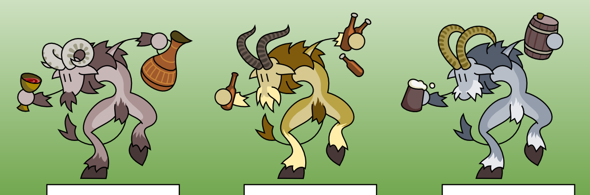
I think these satyrs are knights who have gone questing into the woods and been cursed for their unchivalric vices. In this case, the knights were drunkards. I could easily conceive of gluttonous pig-monsters and maybe slothful bear-men?

These cursed knights would fill a good niche in the theoretical game these are never going to be used for. I didn't feel like the forest witches were actually evil. Cursed monsters gives you something you can feel good about fighting, also making the witches more of a credible menace without making them evil.

Saturday 7 December 2013

Megabots

Super-units in RTS games. They're tricky.

The units with strange or unique abilities/roles like super-artillery or cloaking fields or missile defence are fine. But the generic megabot that's just big and tough and covered in guns is problematic. Lovely idea. Giant stompy robot crushing lesser vehicles under foot. Spectacular. The questions is what function do they serve that an equivalent amount of regular units doesn't? Why build them?

The thor in Starcraft 2 is a lovely example of this problem. A large, impressive super-heavy mech. Like most megabots its primary function is looking impressive. The thor was big, tough and dealt high damage to ground and air targets. But they didn't do much that a bunch of marines couldn't do just as well.

In Supreme Commander 1&2, gameplay niche matters much less. But in general, the megabot units are a more concentrated way to deploy your resources. The megabots are so big and so powerful that an equivalent army of basic units can't be concentrated in a small enough area to be effective.


In the vanilla RTS paradigm units don't perform worse when damaged, so a megabot at 50% health is much stronger than an army with 50% of its units gone. And conversely, you can attack or defend with half an army of tanks, while a megabot that's only 50% constructed is worthless. (Supcom2's "launch half-baked" option excepted). But these differences aren't exactly tactically rich.

So I was thinking about this and I had a weird idea. What if megabots were cheaper than an equivalent army of tanks? Costing maybe half as much as the amount of tanks it would take to kill them.

But taking much longer to build. Really long. That way the megabot's strategic importance isn't what it can do in combat, it's what it requires economically. It requires a different resource to regular units - time rather than money.

So a megabot is an investment, or maybe a gamble. You're accepting a loss of resources with the promise of a massive payoff if you can survive. If other players can scout the in-progress megabot, then it becomes a strategic objective with a tim-limit.

Wednesday 22 May 2013

I think about games a lot.
 
Bioshock Infinite is much more linear than any of its predecessors. The flow reminds me of Half Life 2 more than any prior *Shock game and I wonder if it might have been a better game if they'd gone all the way. But they didn't.

Later in the game there's a few more explorable hub areas, but even then there's a ghost-town feel if you go somewhere before the plot needs you to. It's a little jarring after being otherwise rewarded for exploring every nook and alley.

 
Anyway. There's a trick they use to disguise the linearity that's quite interesting. It's this layout:


When you leave an area, you'll often find that the corridor forks into two, both of which have a sharp corner that prevents you from seeing down them. But if you backtrack after following one to try the other, you'll find that both corridors go to the same area. 

It's a truism than non-linearity usually equals skipped content. By keeping these corridor sections short, they minimise wasted level design. But by knowing that there's a corridor you could have gone down but didn't, it makes you feel like progress is down to your own choices.

Except that The Wizard trains you to look behind the curtain. Bioshock Infinite consistently rewards you for exploring with tangible in-game rewards, and offers no benefit for pushing ahead quickly. The same trained behaviours that give you delicious voxaphones, unstable tonics and loot, also reveal the illusion of your choice. And it was a bit frustrating every time I fell for it, going back and expecting a new area to explore/pillage and finding nothing but a switchback.

And it's interesting to me how a clever technique to make the levels feel more open, clashes with the way the game encourages you to play. 

It's more successful when the areas look like this:
 
It's almost the same trick - whichever way you go you'll reach where you need to be - but on a much larger scale. The corridors are long enough to be interesting, and exploring the alternative route will have enough action to be rewarding. These areas are also large enough that the circular layouts don't feel like corridors. And when they're used as hubs, with different exits unlocking one by one, you might be approaching the action from a different direction each time, which wrings more mileage from the same scenery.

Another game is Darksiders 2. It has a lot of mini boss fights. There's a small cutscene where a giant monster makes a dramatic entrance and then you have to murder them. But it does something clever.

Sometimes you'll get the little cutscene and slay the giant undead scarab hulk or whatever, but then two more of the same monster jump down, sometimes with minions. Holy crap - the game just served you up one as if it were a boss, and now you need to take on *two*? And it makes you feel like a badass when you win. It does this a lot, but it always feels good. 

Of course they're not bosses, they're just a new monster type that then gets added to the normal rotation. But what a way to introduce them! Great showmanship. 


And clever too. The first fight is exciting because of the uncertainty - you don't know what this monster can do. It's also a teaching aid that allows you to learn its attack patterns in a simple one-on-one fight. The followup monsters require you use those skills in a more dangerous and complex situation.

Like the *Shocks, the Darksiders games also reward you for compulsively exploring every corner. It's the Zelda thing where there's collectibles everywhere if you look for them. And finding collectibles is fun, but as a completionist I find myself compulsively looking behind me after every doorway, and carefully inspecting the ceiling of every room. Which is slow and not enormously fun.

Here's a thing:
 
The game is more fun to play when I'm not actively looking for shinies. And when I *do* find a shiny, it's more exciting when I haven't been compulsively checking every square inch. Obviously that would be the most fun way for me to play, except for the gnawing anxiety about missing shinies. And that's interesting to me.

Compare it with Minecraft. I get that same thrill when I see an emerald or diamond block. The layout of caves usually prevents 100% exploration - there comes a point where it's more efficient to find a new cave to explore. But I don't get that horrible feeling that there's diamonds left unmined. I feel no urge to strip-mine the map chunk-by-chunk down to bedrock. Why is it different?

I suspect that it's because Darksiders/Zelda/Bioshock are finite. I know that if I miss a voice recording or health upgrade, that's something lost to me forever. The game will end and I won't have gotten full value out of it. In Minecraft I know there's always going to be more diamonds in the next cave, so there's no stress. It's impossible to complete a collection so I feel no urge to try. It feels so liberating.

Of course the problem is one that exists inside my head. I couldn't argue in good faith that one way is better than another (or even perfectly analogous). But it's fun to examine these things.

Tuesday 21 May 2013

Icon style guide

I've made a lot of icons, and I've tried to keep them to a particular style. That's a little pretentious - my style is a crutch to hide a lack of ability. Still, it's hard to draw over 1600 little pictures without getting better at making them, and so I've suffered quality-creep. The ones I make now are often more illustrative and less symbolic. I include details that, back in the first hundred, I might have abstracted.
  Every good icon I make makes its predecessors look worse, and as I get better I'm making more better icons. 

Still, there's some consistency. From the start I developed a set of unwritten rules about how my icons should look. There's a few exceptions, but they're almost all due to oversight or moral weakness.


White on black
Everything is white shapes on a black background. If I want to do something in black, outline it in white, or put it over a white shape. When actually using the icons for something I can invert them if necessary, but for consistency when browsing the base icons, they're all white on black.

Sharp black and white only
It seemed silly to bother with colour permutations (red heart on black background, black heart on yellow background…) for the icons when that's so easily accomplished in a paint program. I can colour, paint over, use as masks on a gradient or anything else. The simplest possible base icons enables the greatest freedom when using them.
This is why I'm always a little annoyed to see them used as-is; just white shapes on black squares. They were never meant as ready-to-use icons. They're stencils.

Border
Nothing touches the edge of the frame. There's an invisible 1pt no-go zone. Again, this is just for consistency amongst the base icons and ensures I have some bleed when I cut out the icon to use elsewhere.

Fill the frame
The icons are always as large as I can get them within the frame. They'd be much less useful as a set if they were all drawn to different scales. If I need a small heart (for example) I can just scale down a large one. If I really wanted a small heart icon I'd give it some kind of framing detail.

Left to right
Consistency. If an icon has a direction, it's going left to right. Up vs down is more flexible, but when it's isn't common sense I tend towards top-to-bottom.

No lexical symbols
These are meant to be illustrative. No letters, numbers, currency symbols or overly specific symbols. If I needed a letter or a number, I could raster it from a typeface. And if I do one digit I should probably do all of them. Likewise letters. Hash marks are illustrative enough that they feel ok. There's an omega too.
 
Not too specific
I don't want twenty different flavours of axe. If I need a specific icon for a specific variety of thing, I can make it to suit. One or two axe icons will fit most needs. And the icons are supposed to be symbolicaly illustrative rather than perfectly specific anyway.
I've bent this one a lot, but I ration myself. There's a lot of different swords and botles for example, but I only do them every now and then so they don't take up too great a fraction of the total. And I try and make sure they're all sufficiently different from each other to be worthwhile. I'm not interested in doing ten different helmets with only slight differences.
I suppose this one includes other people's trademarks and logos too. No Samus helmet, no buster sword and so on. For several obvious reasons.

Not too abstract
Counterpart to the previous rule. If I need a circle I'll draw a circle. Likewise an arrow, a diamond or other simple geometric shapes. The icons are meant to be illustrative and there's a point at which a shape is too simple to illustrate anything. I've done a few miscellaneous weird shapes, which could be glyphs, thingamabobs or jewellery. The problem is that they're so easy to do I could easily churn out a hundred of them. But even if they're pretty, they're meaningless. There's not much difference between having a half dozen available and having a hundred. They're not challenging to make and usually a waste of time, so I don't let myself do many.

Definition and resolution
This is the most important one and the biggest pain in the arse. There's a minimum line width of 1pt. And that includes negative space - two separate white shapes need to have a 1 pt separation between them. This is my minimum "resolution" for detail. No bumps smaller than 1pt, no shapes smaller than that.
There's necessarily a little leeway where two shapes come together to a point, but I stick to this rule hard as I can. It puts a hard limit on the level of detail I can put in and keeps things consistent.

Line standards
Lines get squared-off ends. If the icon really needs it they might get a taper. But usually not. And no taking the piss either - If there's a taper then it should be a short taper. Sometimes there's a drawn element that is only the width of a line, and then I might round off or taper the ends but, again, usually not.

By the way 
The coloured icons in this post are just sloppy five-minute jobs to make a point.

Saturday 16 March 2013

Game concept braindump

Simple three-player game. Each player secretly picks a number from one to three, then all are revealed at the same time. Each player who picked a number that nobody else picked gains that many points. Everyone else gets nothing. First to 7 points wins. Would probably work with 4 players too.

Thinking about a modular roguelike that is expanded by people playing it, which isn't new by any means. Maybe some kind of "deck-building" game where you're a summoner building up a synnergistic horde of minions from prefixes, suffixes and modifiers that you gain as you progress through the dungeon. If you reach the end of the game, then your "deck" becomes a blueprint for a dungeon floor. ie: come up with a good ice "deck" and maybe the next player will have to travel through an ice level populated with those monsters.

Or maybe the visuals are the customisable part? Make a card game ala magic that starts out with all the cards blank, but players get to draw their own art as they play, slowly collaboratively illustrating the game. After playing a round you're presented with 3 different illustrations for the same card and you vote for your favourite. The exact voting mechanism will be a bitch to design, but it's one hell of a gimmick that is sure to garner public attention from game sites.

Inspired by Star Guard, a 2d scrolling shooter where you die in one hit but have infinite lives. A meatgrinder of a war where wave after wave of disposable soldiers with increasingly outrageous prototype guns are sent to the front lines in desperation.  Each life is a new soldier and carries a new experimental gun. You are given brief uninformative instructions on your weapon when you spawn. Some will be useless in the situation where you are, others will be overpowered, others will be suicidal. Short bursts of discovery and fun, where every failure is a new opportunity. Grenades that bounce unpredictably. A fantastic plasma gun that kills you if it overheats. A super-rocket that only has one shot, leaving you unarmed afterwards. A boomerang gun whose shots you DO NOT want to catch. A nuclear grenade launcher whose blast radius is greater than its maximum range. All mixed in with varied but more mundane weapons.

Saturday 9 March 2013

Supreme Commander 2 Experimentals

I enjoy Supreme Commander 2 a lot. Many people say that the first Supreme Commander is much better, but I am not one of them. Still, sometimes I get bored of SupCom2's range of experimentals, and coming up with concepts that add something new to the game seemed interesting. So I did. I probably came up with a few too many actually, so I had to divide them into categories.

Also I sketched some pictures, which aren't very good, but everything's better with pictures.

Economy structures:

Cybran "Betelgeuse" experimental anti-matter reactor
Late game it can be hard to find room to build more power generators. The reactor generates vast quantities of energy with a much smaller footprint than an equivalent quantity of generators. Defending it is much easier, but it's an all-or-nothing proposition and (of course) it explodes with nuclear force if destroyed.

UEF "Butler" experimental supply relay
Borrowing a little from SupCom1's adjacency bonus, this building improves the efficiency of all buildings in its considerable range. Units and buildings are constructed faster and structures produce more mass/energy/research. Rather than a super-resource building, the UEF gets to make its existing ones more useful.

Aeon "Paragon II" experimental mass generator
Shamelessly "inspired" by SupCom1. After a huge upfront cost, this generates mass resources from thin air. Won't single-handedly prop up your economy like in SupCom1, but neither does it explode.

Defensive structures:

Cybran "Impaler" experimental railgun
Fires superheavy metal spikes that must be individually constructed. Low rate of fire and range comparable to light artillery, but the high-velocity spike deals massive single-target damage to ground units. Basic units will be destroyed instantly with the spike visibly stuck in their wreckage (and salvageable!). Experimentals must get used to wearing a new piercing.

UEF "Skyguard" experimental missile installation
An anti-air missile launcher with enough range to cover an entire base. It fires guided missile volleys that, once launched, will follow targets outside their firing range. It also functions as an anti-nuke launcher (albeit with regular range).

Aeon "Juvac" experimental power siphon
Fires a beam that deals drains energy and deals continuous damage to a single target, visibly flowing from target to siphon. After X seconds (proportional to the target's capture resistance) the target will be powered down. Until the unit is destroyed, its controller loses energy while you gain it.

Ground support units:

Cybran "Skywriter" experimental beam platform
A multi-legged walker with four independent beam turrets which function both as anti-missile and anti-air. Mobile defence for your army.

UEF "Mother bear" mobile support factory
A factory on treads that builds land units and stores them internally. Like the flying carrier and the unitcannon, it builds units faster and at a discount. Only minor firepower, but its two support cranes will repair nearby units.

Aeon "Chelovolt" experimental walking shield
An extra-large mobile shield generator. But don't you hate it when units just walk/fly through your shields? This shield is electrically charged and any enemy units inside it will be struck by lightning.

Ground attack Units:

Cybran "Detonator" experimental bomb hatchery
It builds and stores rolling suicide drones that deal medium damage in a large area, but can be destroyed by anti-ground fire before they reach their target. The bombs will roll over water.

Cybran "Honeycomb" experimental MFRL
A basic walker chassis mounting a huge array of hexagonal tactical missile tubes. The missiles all fire in one volley with a long re-arming delay. Long range and dubious accuracy, but barrages a large area.

UEF "Anvil" experimental siegebreaker
A massive brick of a tank, armoured in every obvious way and with a strong personal shield. Very slow, but the most survivable unit in the game. Armed with a battery of short-ranged explosive cannon and a small rack of tactical missiles. Deals less damage at a shorter range than a Kriptor or Colossus, but takes massive firepower to destroy.

Aeon "Soniwa" experimental sonic resonator
A second tracked experimental for Aeon that, like the Pulinsmash, must deploy to fire. When deployed it energises an arc-shaped array. It fires a distortion wave in a long line that damages every enemy along that line. Closer units take more damage.

Flying units:


Cybran "Commissar" experimental flying cannon
A gunship chassis built around a medium artillery cannon. Slow, but it outranges all non-experimental anti-air. Its short-ranged secondary batteries defend against ground attack, but it's very vulnerable to fighters.

UEF "Hephaestos" experimental flying gantry
An unarmed flying construction rig that that has the construction power of a commander. Cannot assist factories. Good for quick construction of a forward outpost, or just late-game base expansion.

Aeon "Herbest" experimental reanimator
A tripartite saucer with dangling jellyfish-like legs. It repairs wreckage into units, transforming other factions' wreckage into aeon equivalents. Experimental and structure wreckage is not restored, instead converted into a proportional number of basic aeon units. Can also repair ground units.

Monday 14 January 2013

Nostalgic pixels

Today I remembered that I made these little pixel guys a few years ago. And I felt nostalgic. So I looked them up and... huh. These are better than I expected. I'd assumed they'd have aged much worse than this.

There's still some lemons of course. The gunslinger was obviously the first onto the page. The gladiator's duff and the aqua wizard is a bit forced. But the puppeteer and the ninja are cool to me and I think the monk is pretty spiffing.


I deliberately limited my palette to black, white and one colour. I can't remember exactly why. Chasing the Gameboy aesthetic maybe? I've a feeling I just thought that stark black, white and one colour was an interesting look. I do enjoy structured limitations after all (like minimising linecounts for my vector stickpeeps).


I also found these pixel lixards that I'd forgotten about. That was a typo - I meant to say "Pixel lizards" but I enjoy the portmanteau.  I was thinking about dwarf fortress when I drew these. I also have a sheet of lizards carrying various weapons and tools but it's boring. Courier lixard is best lixard.

Saturday 5 January 2013

Glaivers

Not exactly new. These are modified from one of the previous generation of stick figures. One of the better ones, but I was going through another detail-inflation phase so a few parts had to be scaled back.

I thought of the original as a "dragon knight", hence the scalloped armour and weapons. Don't take that too seriously though - they're generic designs. I don't have anything interesting to say about the linework. The colours on the other hand...

The top row are what I come up with if I have a blank white screen and a default palette. I always slip into default R, G and B. Boring. The green one is ok, but they're all too Lego-coloured.

After getting annoyed by the Lego colours I redid them from interesting-looking colour palettes I found online in places like http://chromaa.tumblr.com and http://www.colourlovers.com/palettes and I'm a lot happier with the look. I wasn't slavish; I kept #3's red weapon for example.

I was deliberately restrained with the shading details. I want to use flats whenever I can get away with it. However I did shade the fleshtones, for the first time. I think that's a big improvement and something I want to keep up going forwards. It fixes a long-running problem I was having with skin tones not looking like human skin because they had no depth of colour. Faces are important and deserve extra attention. I'm still sticking with the uniform oval-shape and line-eyes, but I suspect it's only a matter of time before I give that up for flexibility, expression and character.